|
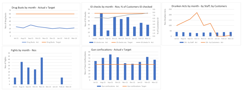
Its layout is based on a real example, albeit the original was worse. Firstly, it had nine graphs, not five. Also, its graphs had multiple y-axes and more lines and legends, etc. But if my before is too bad, graph-lovers dismiss it as unrepresentative. Hence this layout.
And surely those graphs help stuff pop from the page: “Look! A steep upward line!! Nice!!!”. No. To grasp it all, readers must first answer key questions.
Do all graphs cover the same time period? After scrutinising all x-axes and reading 'Jul-21’ five times, readers realise that, yup, it’s the same time period.
Any truncated axes? Truncating the y-axis changes how we judge a graph, for it can turn a shallow trend into a steep one. Readers must study all five y-axes.
Is up good or bad? Think of, say, income and complaints. For income, up is good; for complaints, up is bad. It’s not enough merely to see if a line is up or down.
What legends to decode? The above layout is replete with legends, which create puzzles for readers to decode. Of course, labelling lines and columns directly overcomes this, so this problem arises more with bad graphs than good ones.
To conclude, if we think these graphs offer a quick at-a-glance overview, we’re deluding ourselves. We must acclimatise to them.
The graphs also lack detail – and hence lack repeatability (this email has more on this). Imagine you bump into bosses who ask: “The dashboard… anything of interest?”. You say: “Gun confiscations are down” – to which bosses say: “OK… by how much?”. You’re then left hanging in the wind. “Hmm… dunno”, you say – and then diffidently add: “Well, last month’s column was bigger than this month’s…”. Columns lack repeatability.
Of course, we could put numbers on each column – but that's just a badly laid out table. (Also, we could put 'red- amber-green' blobs by each graph - but previous emails reviewed that.)
One other thing: we’re assuming that readers engage with the layout. No. Don’t confuse the verb glance at with the verb engage with. Often, we glance at graphs, but don’t engage with them. Also, graphs like these suffer diminishing marginal returns. If we’ve a graph every page or so, we might scrutinise it; if we’ve several grouped on a page, we glance at them; if we’ve a dozen grouped on a page… well, we throw our hands in the air and give up. Which explains why many graphs have errors in them and such errors aren’t even noticed.
But there’s more. Would you accept columns for something that you care about? E.g.:
Your annual pay-review chat: imagine the boss wants to show you your salary over the last four years (“Look… lots of big rises recently, so this year you’ve a small rise”). Imagine the boss clicking to a slide and saying: “Here's a graph of your last four years’ salary”. You’d think they’d gone nuts.
Your sports team’s results: imagine you say to a mate: “Jeez… I feel like we've struggled for the last six months”. Your mate then looks up stats and says: “You’re right... this graph shows points won in each of the last six months”. You’d find another mate to chat to.
At this point though, graph-lovers cry foul and raise counter-arguments:
Surely over time, we acclimatise quickly to a dashboard of graphs. Surely after a few months, readers know that all graphs cover the same time period, that no y-axes are truncated and they know what each line and column represent. Hence readers then quickly grasp what they convey. No. Firstly, most readers get many reports… do you honestly think they remember the detail behind your dashboard-layout? And if you reckon they do, put it to the test: remove all legends and x- and y-axes labels. See what happens. You reckon readers won’t mind their absence. I reckon readers will complain.
Surely, Jon, not all graphs are bad? Of course not. I love graphs. I just don’t like bad graphs (albeit all pie charts are bad… at least the above layout thankfully eschewed them).
So far, so bad. And I haven’t even started on insight and actions. Yes, something isn’t going well – but so what? Should I worry? To resolve it, who is doing what by when at what cost to sort? Etc. Next month we start to see what to do instead. It’ll take several emails to get to where we need. For now though, here’s two stories on graphs in reports:
Fifty graphs bite the dust: In corporate life, I once was given a yearly competitor benchmarking report to update – previously, Marketing did it, but this year they were busy, so I got given it. The report had 50 graphs, spread over 53 pages. One page, one page-filling graph. I removed every graph and instead did tables and comments. The report went to the biggest bosses in a big company. They loved it. No-one said: “What have you done with the graphs…?”. The report never went back to Marketing.
A neat trick for trendlines: a draft report had two thirds of a page taken up by two graphs – one on staff, one on output – and its author agonised. He had good news to convey - even though staff levels were down, output was up - but how to create graphs to convey this? Two graphs? One graph with two axes? Etc. I said: “What would you say if talking on the radio?” (this is the neat trick). He said: “In the last six months, staff levels are down X%, but we’ve increased output Y%”. He then realised he didn’t need graphs. The words did it. Maybe a productivity ratio would also work (“Productivity up Z%”). As I say on Courses: “They say a picture paints a thousand words, but trendlines often badly paint just 10 or 15 words”. Or: “Graphs are great if you want the trend, but often we just want the outcome (e.g. ‘Income is up 10% p.a. for the last five years’)”.
The fun stuff: several people sent me these charts of countries' GDP and of languages.
|