Dashboards, part 4 - making readers' lives easier... and Paul Simon again

This is the fourth in a series of email updates on dashboards. The first reviewed a typical dashboard – a page of graphs – and explained why it didn't work. The next two emails then took the graphs’ underlying data - could we improve what we do with it? Today we improve it further. Previously we got to Figure 1 (and to save space, I’ve shown just the three most recent months of our nine months of data).

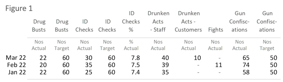
It’s not bad, but it suffers from a problem that afflicts many tables: it shoe-horns column headings into single cells. For instance, near the middle of the table, one column heading has the words 'Drunken Acts - Staff' all within a cell that sits atop a series of numbers.

This creates two problems:

IFUTRTI (‘It Forces Us To Resort To Initialisms’). Long labels don’t fit well in single cells, so we resort to initialisms – and I’ve seen dreadful ones: “% change in PY CQTD Fct 23 v Act 22” (what the heck?!?). OK granted, Figure 1 thankfully avoids initialisms (other than 'ID'), but shoe-horning stuff into single cells creates an arguably bigger problem.

Readers struggle to grasp structure. When readers’ eyes first land on Figure 1, they think: “Ah… ten columns of data”, then after scrutinising it for a bit, they realise: “No, wait… one group of two, another group of three, then a group of two… then a single column, etc”. Figure 1 forces readers to work out such groupings for themselves. (This problem arises constantly in Finance packs where tables are a right royal mix of columns - 2023, 2022, Actual, Budget, Var, £, %, YTD, Month.)

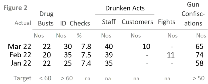
Instead, straddle column headings over the common columns to which they relate. Readers more easily grasp structure and groupings – they spot similarities where stuff is similar, and spot differences where stuff is different. Readers more quickly acclimatise to the table.

See Figure 2 (again, it’s just the three most recent months).

‘Drunken Acts’ straddles two columns - the columns for 'Staff' and 'Customers'. And ‘ID Checks’ also straddles two - the columns for 'Nos' and '%'. Readers see connections between data (albeit we can still improve the column headings a bit more - tune in next month).

Notice that Figure 2 no longer has three separate columns for each of the three 'Target' figures. Each 'Target' didn’t change over the months shown by the table, so those three columns took a lot of space to say little. Instead, the three 'Target' figures are now at the bottom of the relevant column. Which also means we needn't repeat the word ‘Actual’ seven times – every number is now ‘Actual’, so we show it just once, top left.

Finally, for columns where there is no 'Target', I put ‘na’. It’s in a small font and greyed down. If I’d instead left the cell blank, readers might incorrectly think that some Targets are missing. Maybe add a note that explains to readers that ‘na’ means ‘not applicable, i.e. no Target’ (as opposed to, say, ‘not available, i.e. we dunno what it is…’).

Yet again we’re making progress - but yet again, we can still do more. That’s next month. Time for the fun stuff (and again it’s the ‘Fifty Ways’ pastiche we saw in a previous email). Do quickly read it because in three emails’ time, I show how to use the theme to help prevent bad graphs. There’s also an absurd punchline. Stay tuned.

Fifty Ways To Avoid Tables: do you have numbers that you need to convey? Worried that readers hate tables? Fear not, there must be fifty ways to avoid tables (with thanks to Paul Simon's 1975 song) – last month you saw four ways, and here’s four more (c'mon everybody, sing along):

“Do something dumb, chum. Try Coloured Icons, Ron (Fig 3). Use Fading Arrow Heads, Ted (Fig 4). Resort to Blue Blocks, Doc (Fig 5) – or put two as a Cluster, Buster (Fig 6).

And set yourself free.”

More again next month - and all examples really existed in published reports, they're not illustrative ones created by me.

‘Til next month.

Jon

P.S. A thought: what numbers should we show? Above, to save space in this email you saw a truncated version of the original dataset - the full set goes back nine months... but do we need to show nine months of data? After all, if there isn’t a seasonality to the numbers, maybe you needn’t go back that far. If there is a seasonality, don’t show monthly figures anyway; show rolling-average figures. And if something big happened six months ago that still affects the results to date, your commentary would mention it, e.g. “Still behind budget because factory burnt down in May”. Just a thought.

P.P.S. Is this dashboard-redo getting obsessive? No. As I said in a previous email, the devil is in the detail. Which is why most dashboards are awful. Hardly any are good. Make yours fantastic, and every month thereafter, your bosses admire it... and you shine. A great dashboard is the gift that keeps giving.

Clarity and Impact Ltd | +44 20 8840 4507 | jon@jmoon.co.uk | www.jmoon.co.uk

To receive these emails at a different address, email me with details.

Want my GDPR policy? Click here. It's a bit irreverent, plus has two jokes.

Want to see previous emails? Click here for loads.

Been forwarded this email? Want to get future updates directly? Click here

Clarity and Impact Ltd

MailerLite