|
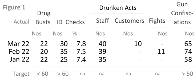
Now, units are measurement are right-aligned… but sometimes with spaces added afterwards (e.g. Nos <space><space>). The units sit where I want them to sit, not where Excel’s defaults put them. I did that by occasionally adding spaces. Sometimes one space. Sometimes two. Or even three. Whatever works best. It’s pure trial and error.
I also did one other small tweak. I reformatted the Customers numbers. They’re still right-aligned (which is good, it helps us do mental arithmetic), but they’re shunted a bit more into the centre of the cell. Study the ‘1’ of the number '10' in that column – previously it lined up with the ‘e’ of Customers, but now lines up with the ‘o’ of Customers. Which looks better - scan the table's columns from left to right... columns of numbers are now a bit more evenly spaced.
We’re getting there, but there’s one last run round the block. That’s for next month. Time for the fun stuff - and again it’s on the Fifty Ways pastiche we saw last month. Do quickly read it because in two months, I show how to use the theme to help prevent bad graphs. There’s also an absurd punchline to them. Stay tuned.
Fifty Ways To Avoid Tables: got numbers to convey, but fear that readers hate tables? Fear not, there must be fifty ways to avoid tables (with thanks to Paul Simon's 1975 song) – previous emails showed eight ways; here’s four more (c'mon everybody, sing along):
|