|
Red-Amber-Green reports - why most are bad
This article looks at why you shouldn't mostly avoid RAG/Red-Amber-Green reports - and what to do instead.
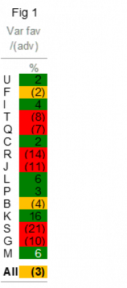
Giving the red card to RAG reports: Figure 1 is a RAG report for 15 areas of activity, all denoted by letters (U, F, I, etc) - maybe they're projects, units, risks, people, income, etc. 'Red' means doing badly, 'amber' doing so-so, and 'green' doing fine (obviously, we've defined 'badly', 'so-so' and 'fine', e.g. 'badly' = 5% or more worse than budget).
|
|
|
RAGs are good, no?. Their colours engage, help right-brainers, are intuitive, etc. No. Flawed logic for several reasons. (1) 5 to 10% of people are colour-blind or colour-deficient, and for them, it’s a GLGG report: Grey, Light Grey, Grey… as it is if it’s printed in black-and-white. (2) Coloured blobs often hinder readability - it’s tough to read the underlying numbers. (To remedy this, some RAGs show numbers in white if a cell is red or green, e.g. see M near the bottom of Figure 1 - but it's still not good.) (3) Colours inelegantly butt up to each other. (4) It isn't that intuitive: when we did good work at junior school, teachers didn't adorn it with coloured blobs, but with ticks and crosses. (5) It lacks granularity – it can score only out of three.
In an attempt to remedy this last one, some people do RDAALAG reports: Red, Dark Amber, Amber, Light Amber, Green. Crazy. As are RAGBBl reports – Red, Amber, Green, Black (projects not yet started), Blue (finished). How contrived.
|
|
|
So do a better RAG: in Figure 2, coloured blobs are in a separate column on the right and no longer visually interfere with numbers. We more easily see detail. Also, blobs are smaller, more elegant and no longer butt up to each other. (I put a white border around each cell.)
Or do something better than a RAG: Figure 3 is a RA layout. Red, Amber. We don’t need G (green). RA layouts have less visual distraction than RAGs. Without Green, Reds and Ambers stand out more. Sounds obvious, really. Maybe it’s dispiriting to report just poor and so-so stuff, in which case try an AG report (Amber, Green). Or a RG. You get the picture. All are better than RAGs. They don’t work well in black and white though, plus they lack granularity. So let’s continue.
|
|
|
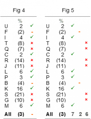
A report that ticks all the boxes (well… it ticks the good ones): See Figure 4. Ticks, dashes, crosses. It works in black-and-white, and – if you want more granularity - do double-tick to double-cross with no dash… it scores out of four. To score out of five, do double-tick to double-cross with a dash. They’re intuitive too, teachers put them on our homework. Finally, if bosses demand colour, do a red cross, an amber dash and a green tick – and maybe even omit the dash. We need only two of the three indicators.
However, in Figure 4, all ticks, dashes, crosses are in the same column, making it trickier to see the wood for the trees. So try Figure 5. They’re in separate columns and no longer visually compete with each other. There are totals at the bottom too – seven ticks, two dashes, six crosses. It gives readers insight and overview.
|
|
|
Sorting it at last: Figure 6 sorts it all between fine, so-so and poor (and if you prefer to see poor at the top, just reverse the row order). Maybe the right column would be better with ticks and crosses, not blobs, but now we’ve sorted it, it doesn’t matter anyway. We don’t need blobs. Cover them and we lose nothing. The three sub-headings spell it out fine.
We’ve reached the punchline: RAG layouts are often nothing more than badly sorted lists. Reorder the list and we don’t need the colour coding.
But... however... what about...? What if we've arrows that compare with last month (if you haven't seen such layouts, count yourself lucky)? What about racing cars and fighter jets - their dashboards have RAGs, no?
|
|
|
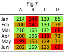
And what if we can't put all the reds together? Fig 7 shows sales by month for four products (A, B, C, D). We can’t reorder it, we must show figures by month and product. For answers to all these questions - and many more - see Chapter 31 of my red book.
Jon Moon
|
|
|
Clarity and Impact Ltd | +44 20 8840 4507 | jon@jmoon.co.uk | www.jmoon.co.uk
To receive these emails at a different address, email me with details.
Want my GDPR policy? Click here. It's a bit irreverent, plus has two jokes.
Been forwarded this email? Want to get future updates directly? Click here
|
|
|
|